New Start: Brand Inception for a Youth Mental Health Foundation
www.newstartfoundation.ca
SUMMARY
New Start Foundation is a foundation for youth mental health and addiction, created by Sunnybrook Hospital and Bellwood, a mental health and addiction clinic in the Edgewood Health Network (EHN). At the time of this project, the foundation had not been established yet.
I decided to pursue this project as part of my UX/UI Designer Essentials Certificate at Red Academy, to improve upon my UI & web design skillset while working on something that I am passionate about; youth mental health.
My Role: Graphic and Web Designer
Timeline: Sept-Dec 2018
Tools Used: Adobe Illustrator, Sketch, Invision
DESIGN PROCESS
I began the design process by speaking with staff at Bellwood who were establishing New Start, to understand what they were looking for in terms of content and mood. Since this was in the very early days, they were open to hearing a fresh perspective from someone on the outside, as long as the overall brand identity remained closely linked to Bellwood and Sunnybrook.
I then turned to the EHN and Sunnybrook websites to get a sense for their mood, colours and overall brand. Since this is a partnership between the two, I wanted to create a brand that would encompass both. From there, I took note of elements on their pages and came up with new ones to explore further.
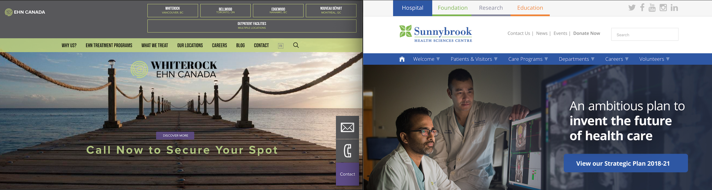
EHN Canada & Sunnybrook Hospital's website home pages
I then used a Design Inception template to help organize my thoughts in terms of the 'why', the mood and visual language I want to elicit. I also developed a mood board to visually capture these elements.
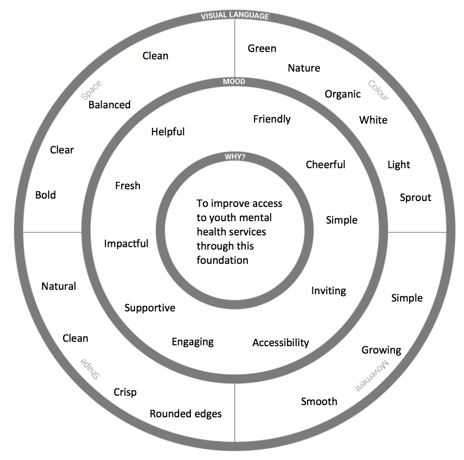
Design inception
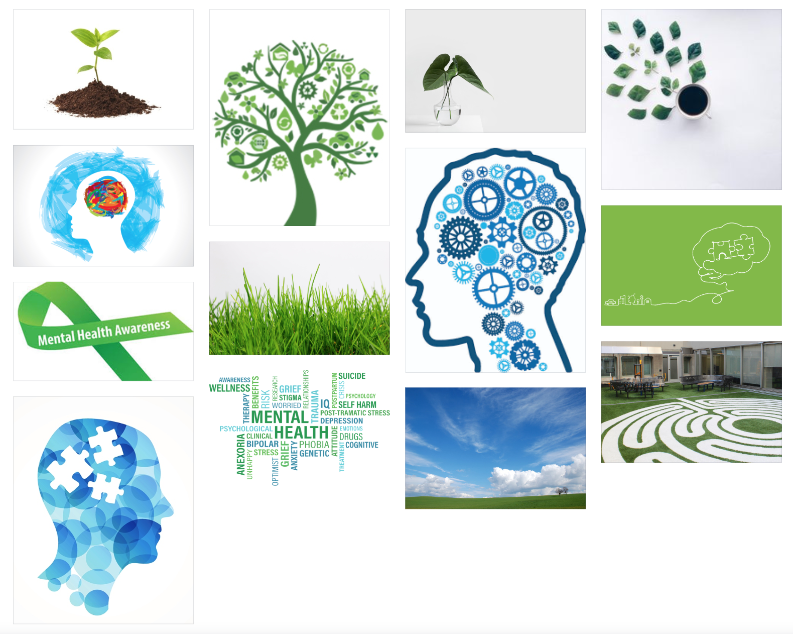
Mood board
BRAND IDENTITY
COLOUR PALETTE
Leveraging my mood board and theme, I wanted to keep the colours organic and muted. Originally, I had imagined the website to be different shades of green with hints of blue, but after exploring this further and getting feedback, I decided to do the reverse: have the main aspects in blue, and use green and red for stand-out items such as calls to action (CTAs), icons and imagery. I used Adobe Colour Wheel to find monochromatic blues and a complimentary green and red.
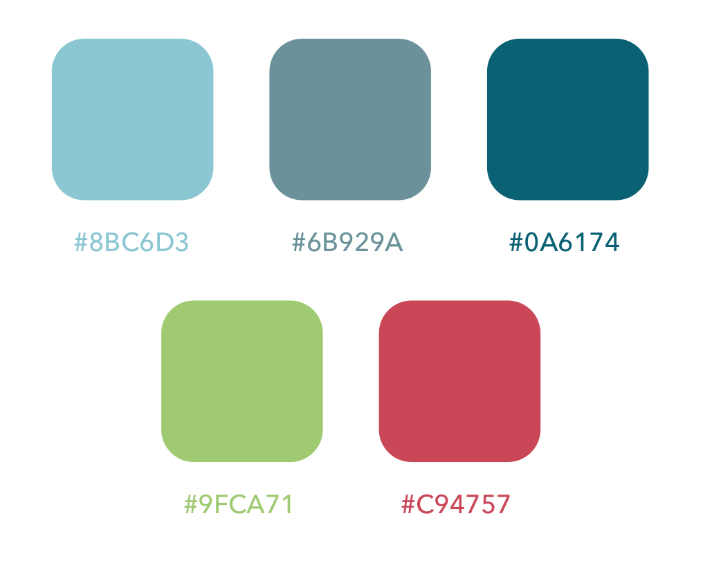
Colour palette
TYPOGRAPHY
I chose a simple, modern sans-serif font that was common and easy to read, since the website would have a lot of information:
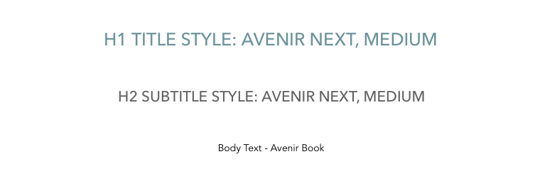
Typography
LOGO
New Start Foundation was born out of a partnership between a mental health clinic network & a leading Toronto hospital, thus I wanted to ensure that the logo encapsulated both existing brands.
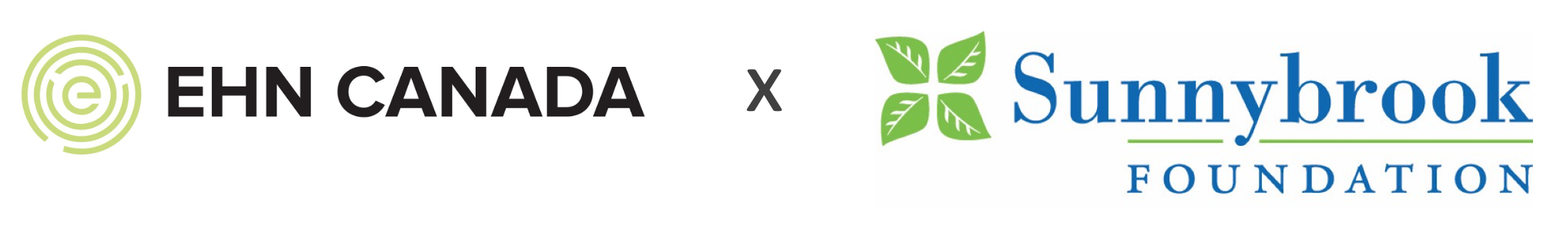
Partner logos
Using a sprout to depict a 'new start' in combination with EHN's labyrinth logo and Sunnybrook's leaves, a logo was born over several iterations in Adobe Illustrator:
Logo evolution
Adding text for the website (in English & French), the final logo became:
Final logo
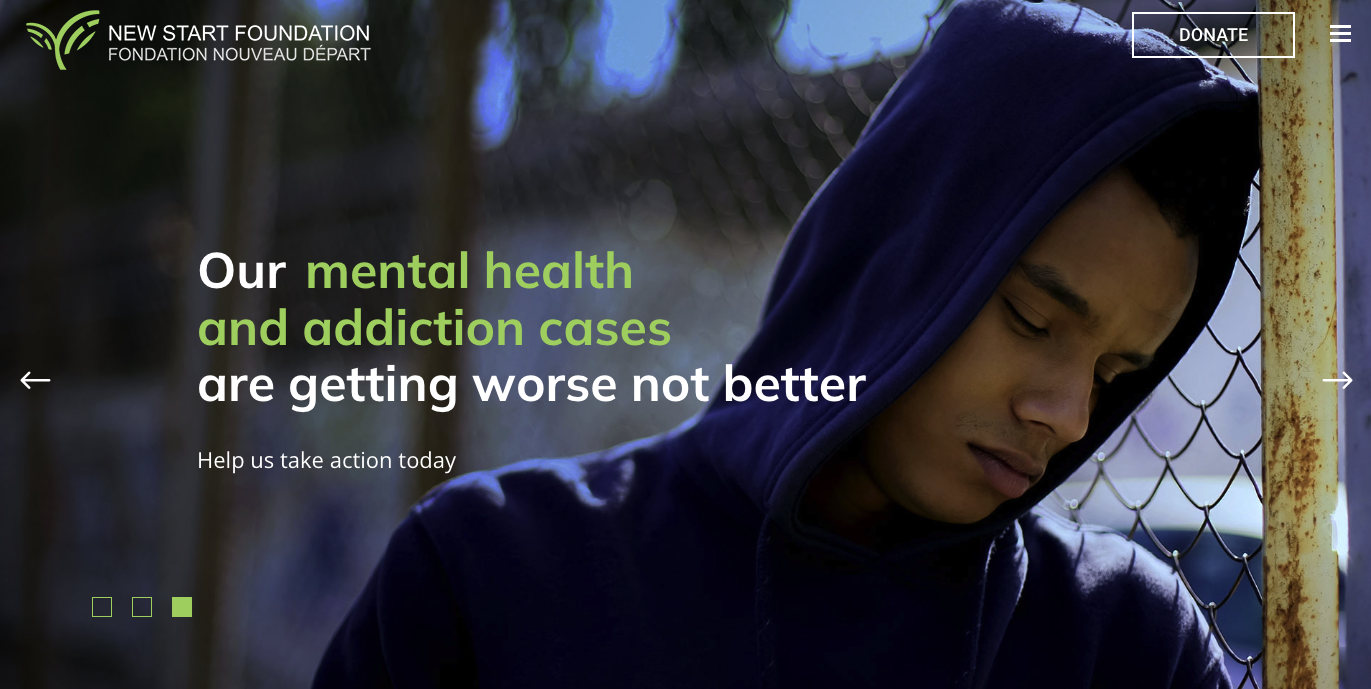
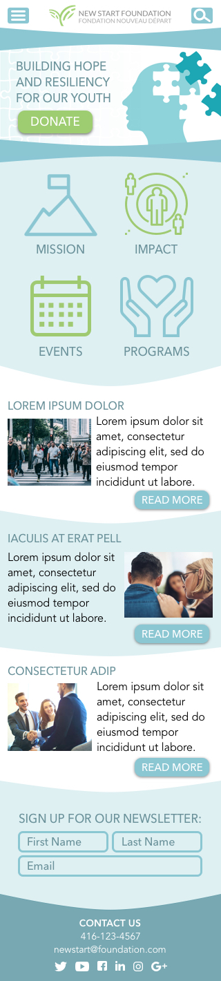
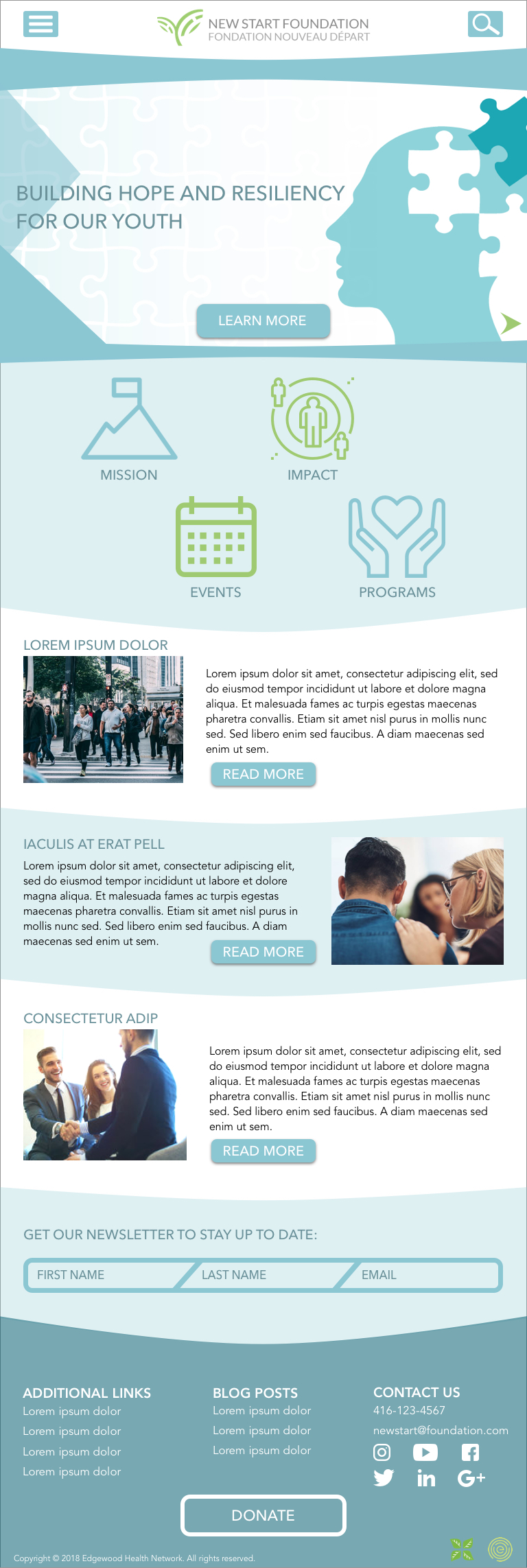
Current website home page
WEBSITE CONCEPT
WIREFRAMES
As I was testing out different colours to achieve the correct mood, I was also developing wireframes for the web layout. My desktop pages followed a central pattern with buttons on the side (reverse F), and for pages with more icons and facts, I switched between 2-column, 3-column and Z pattern layouts. Each section had a different column structure than the previous to make the structure non-linear and therefore more interesting to scroll through. The mobile and tablet wireframes followed a similar pattern, with less text and large icons because people like to skim on their phones and be able to navigate easily.
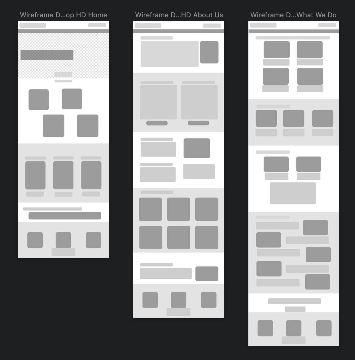
Desktop wireframe
DESIGN ELEMENTS
Based on the colour palette, I integrated iconography from FlatIcon that matched the theme. I also created buttons for desktop including a default & hover position, and for mobile and tablet.
Iconography from FlatIcon
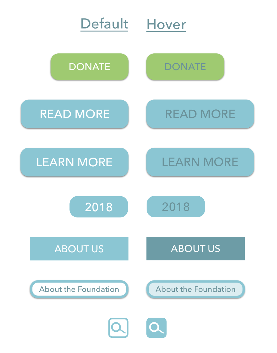
Desktop buttons
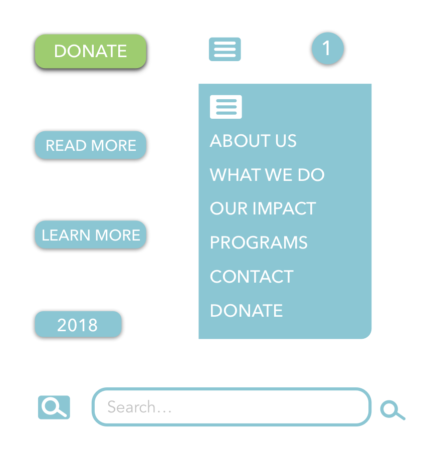
Mobile/Tablet buttons
PROTOTYPE
I designed desktop, tablet and mobile versions of the website in Sketch and InVision. The content is not complete as this was a design exercise, however the content would be organized as follows:
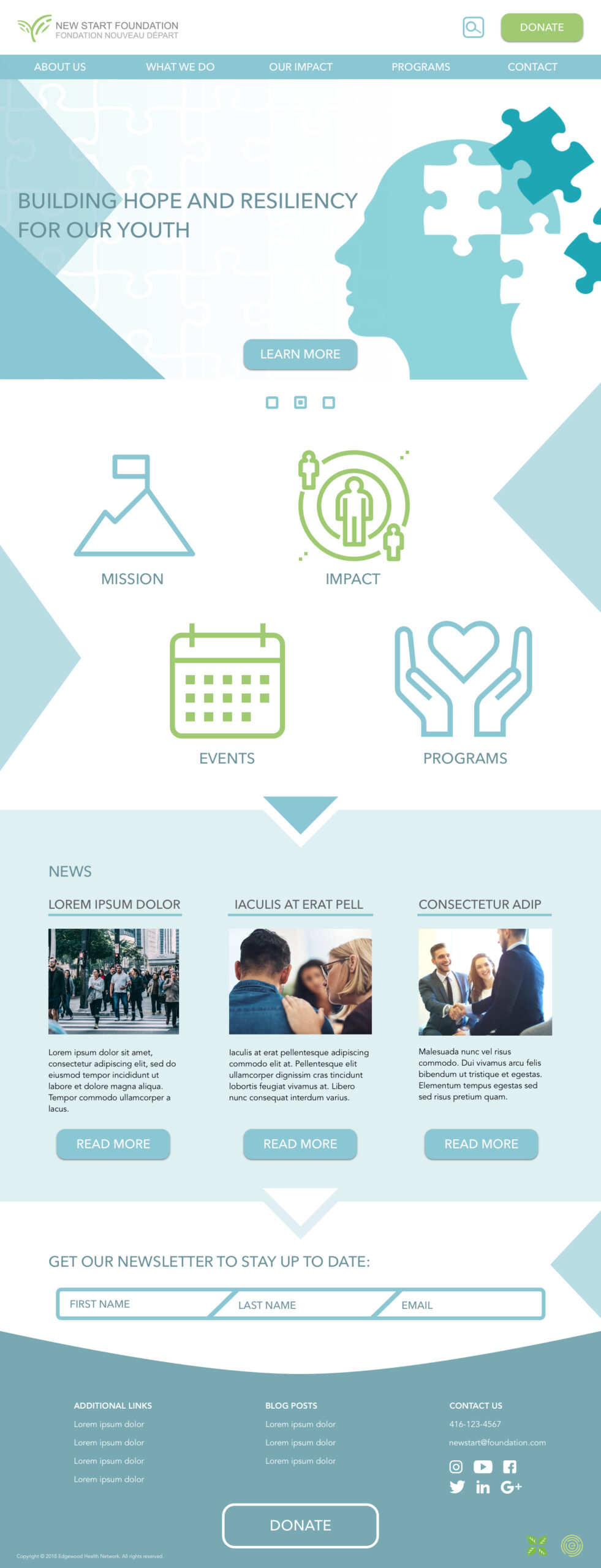
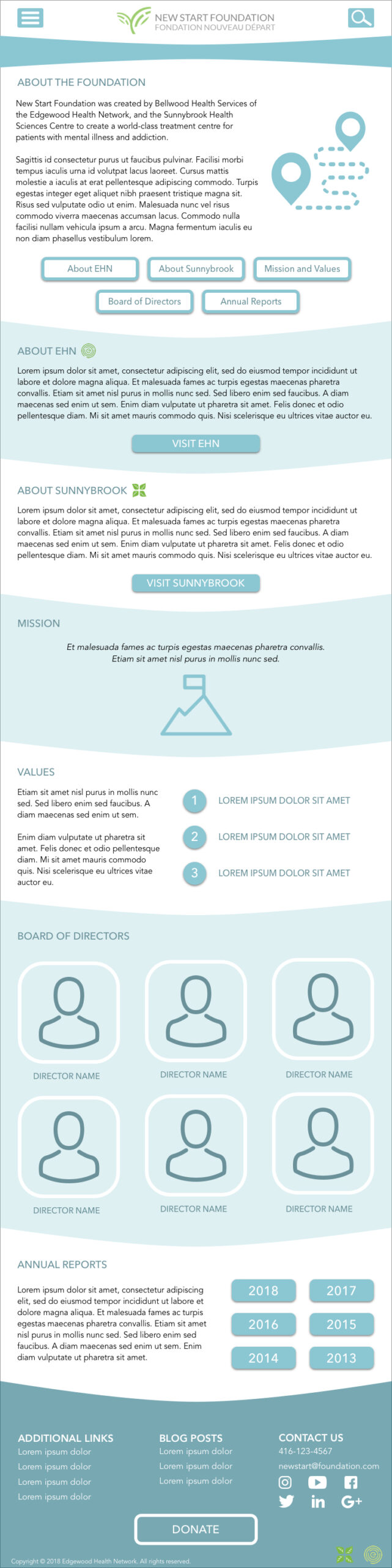
Home Page: Hero, large CTA icons for important pages, recent news, a newsletter signup, and donate buttons at the top and bottom.
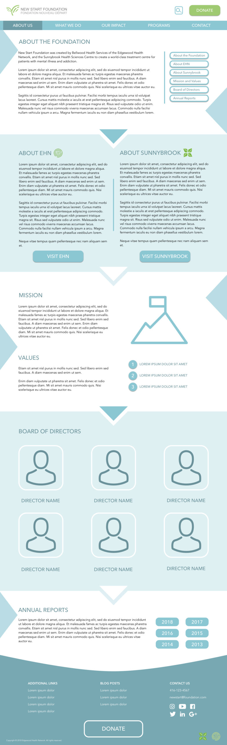
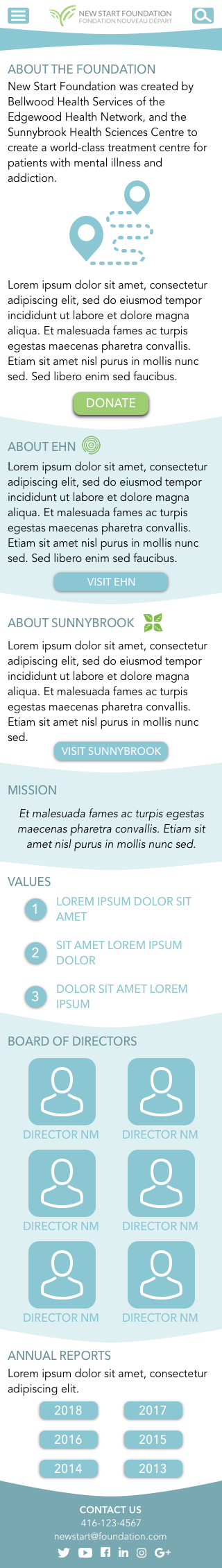
About Us: About the foundation itself, founding partners, mission and values, board of directors and annual reports.
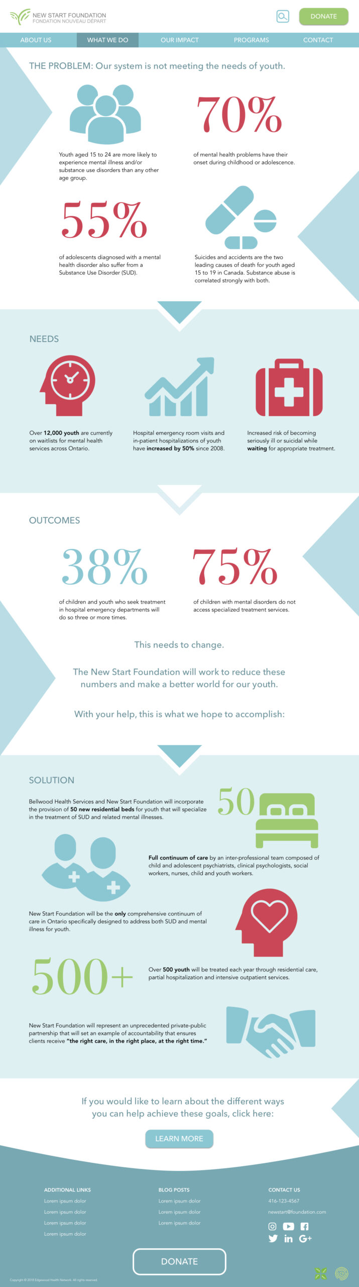
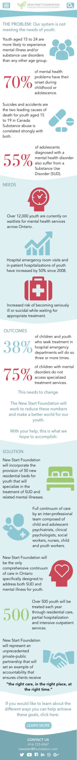
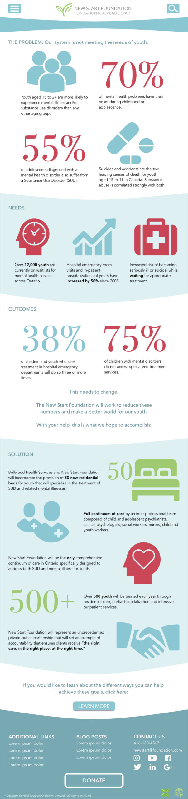
What We Do: The problem the foundation is solving, infographic/facts about mental health, needs, outcomes and the proposed solution.
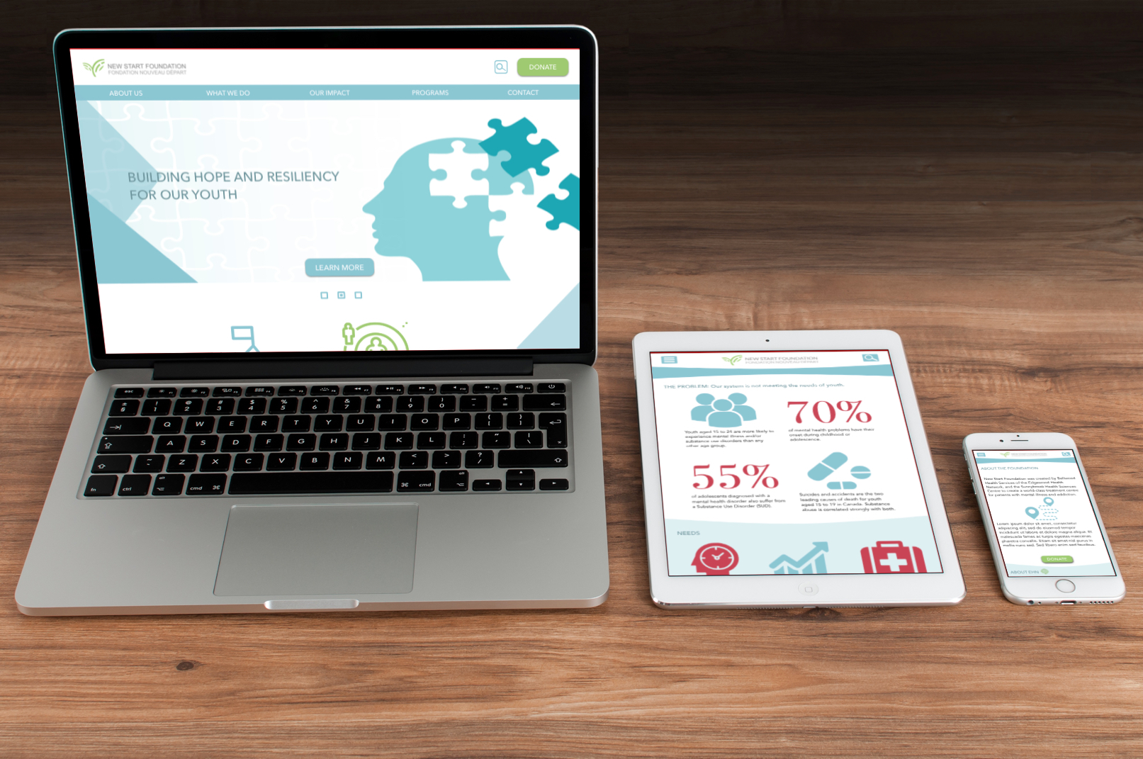
Laptop, tablet and phone prototypes
DESKTOP CONCEPTS
MOBILE CONCEPTS
TABLET CONCEPTS
KEY TAKEAWAYS
My goal from this project was to improve my UI and web design skills for an industry I am passionate about. This was the very first web design I worked on, where I learned how to use Sketch for wireframing and design and InVision for prototypes and mockups.
To improve on this design, I would consider:
- Having bolder contrast in the colour palette and typography
- Include images of real people
- Include testimonials about outcomes of the foundation
VIEW MY OTHER PROJECTS:
Xpan: A Less Invasive Surgical Access PortPhysical Products
Xpan Brand Revitalization: Logo & Web DesignDigital Products
Fino: A Youth Financial Education AppDigital Products
AR Needle Guidance System for Heart Fluid AspirationPhysical Products

100% Reusable Faceshields for COVID-19Physical Products