Brand Revitalization: Establishing Xpan as a Professional Medical Device Company
www.xpanmedical.com
SUMMARY
The majority of my time at Xpan was spent on product design and development (See Xpan Design). However, as 1/2 of the team in the early stages, I decided to leverage my interest in graphic and web design to revamp our logo, establish a colour palette and pitchdeck style, and integrate them holistically with conference marketing materials and our website.
My Role: Graphic and Web Designer
Timeline: Logo Summer 2019, Website Summer 2022
Tools Used: Adobe Illustrator, Wordpress, Powerpoint, Google Analytics
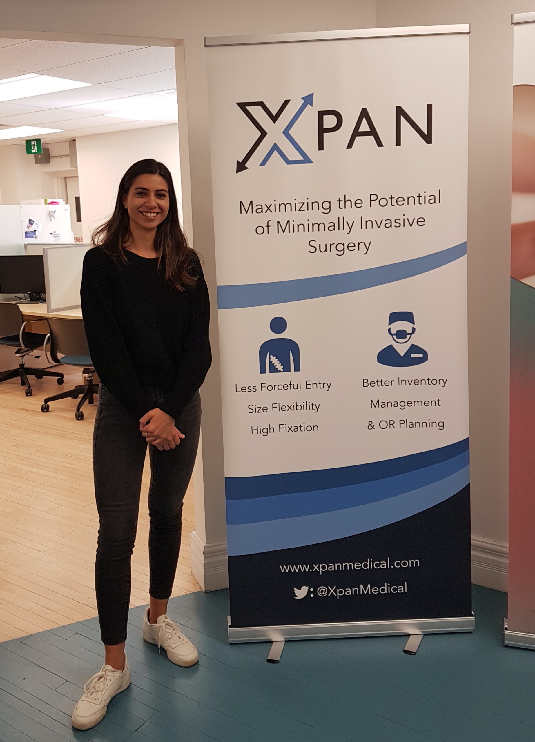
Me, next to the banner I designed for a medical conference
COLOURS
In the medical device industry, blue is a colour often associated with trust, professionalism, knowledge and calmness. My main goal was to develop a colour palette for the logo, conference marketing materials, pitchdeck and the website that would elicit these qualities. For simplicity and cleanliness, I developed a monochromatic palette as follows:
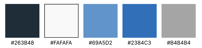
Colour palette
LOGO
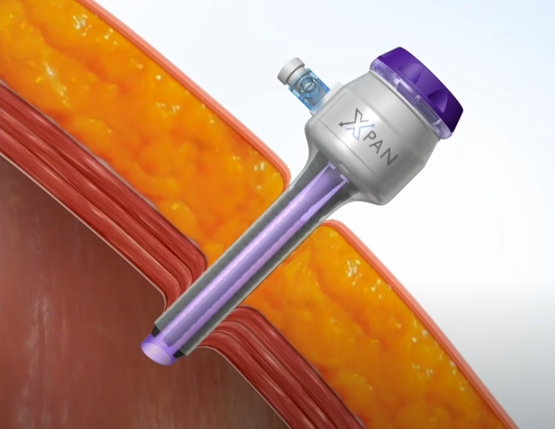
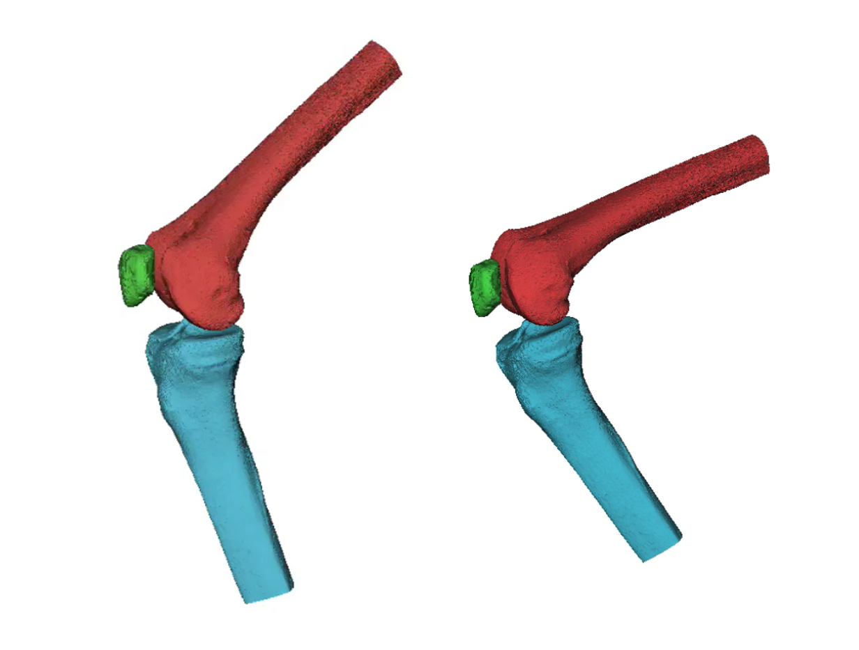
The name 'Xpan' was inspired by the company's medical device product: an expandable surgical access port.
According to some end user and business advisor feedback, our original logo difficult to read, especially if the name 'Xpan' was not spelled out nearby. For the re-design, my goal was to retain the expansion symbolism, while modernizing the logo and adding some colour. After several iterations in Adobe Illustrator and external feedback, a new logo was born. See the evolution below:
Xpan logo evolution
Using this colour palette and logo, new business cards were created using Adobe Illustrator, along with conference graphics such as the banner shown at the beginning of this page. An example of an early business card leveraging this palette with an inverted logo can be seen below:
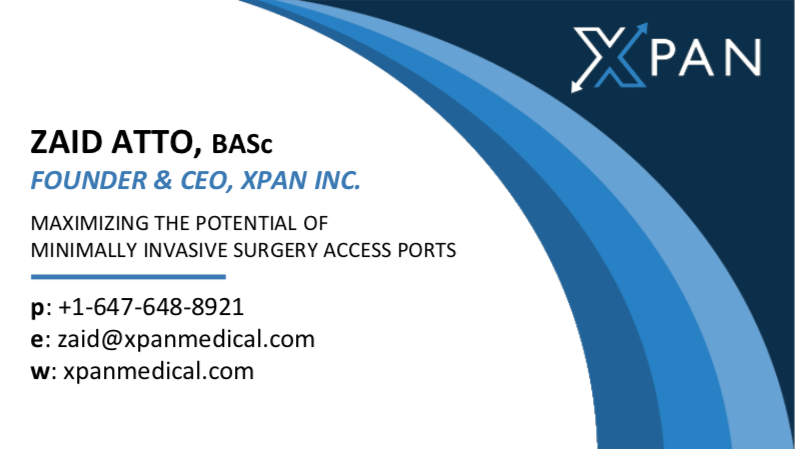
Business card front
Business card back
WEBSITE
As Xpan was getting more traction with end-users and prospective investors, common feedback was that our existing website was not very informative (it was a single page with minimal information and no team description). To establish Xpan as a professional medical device brand, we would need to develop an informative website that shows the merit of our product and a reliable team. I discussed internally, created sample designs and surveyed our advisors to get early feedback and iterate.
Using the established colour palette and overall theme, I designed our website which can be found here: https://xpanmedical.com/
DESKTOP
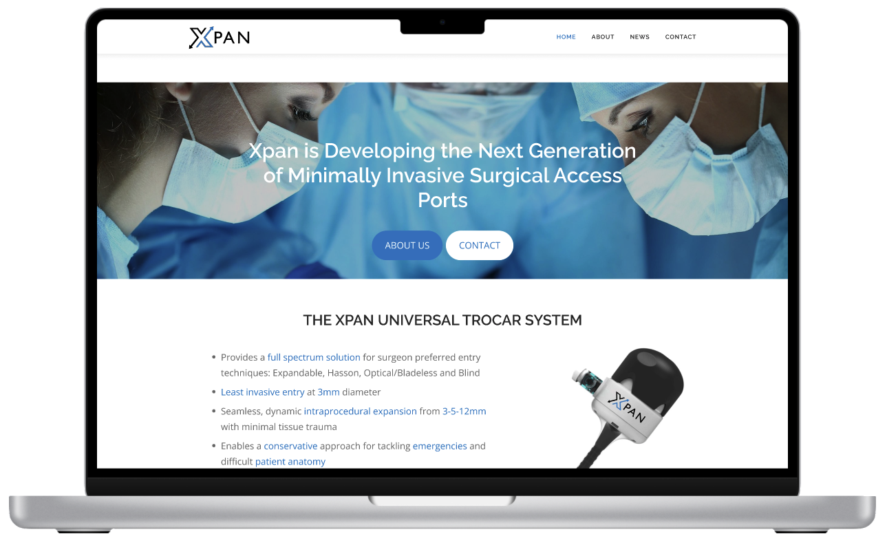
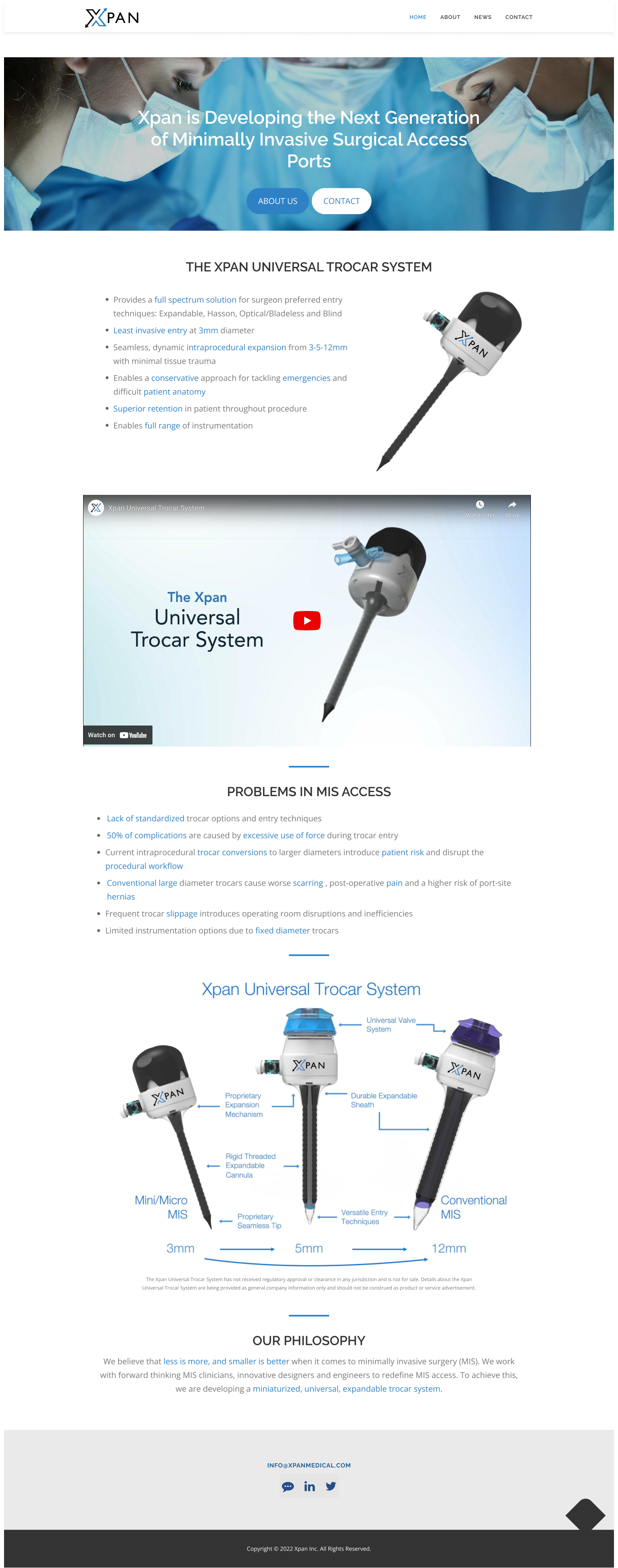
HOME
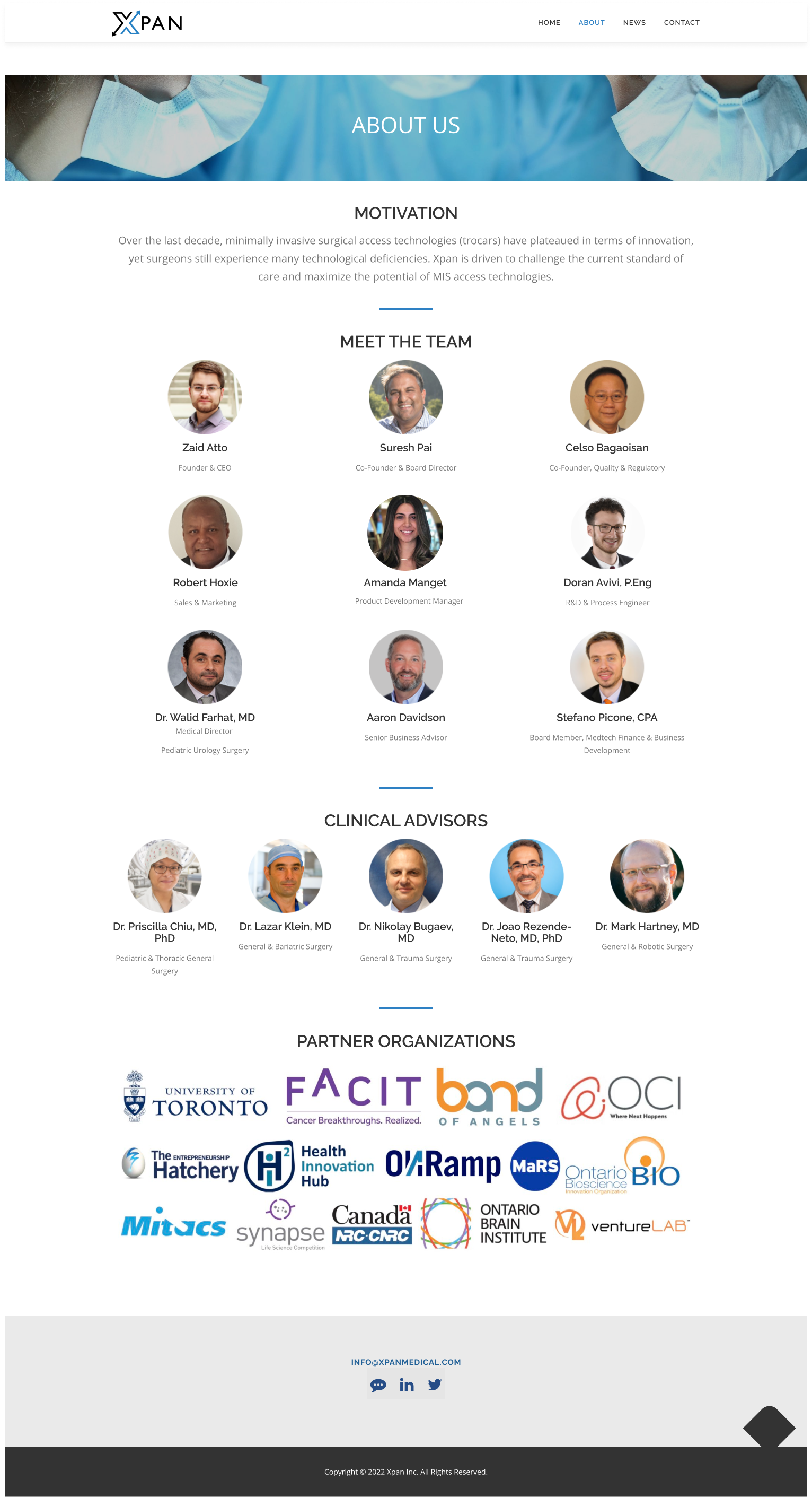
ABOUT
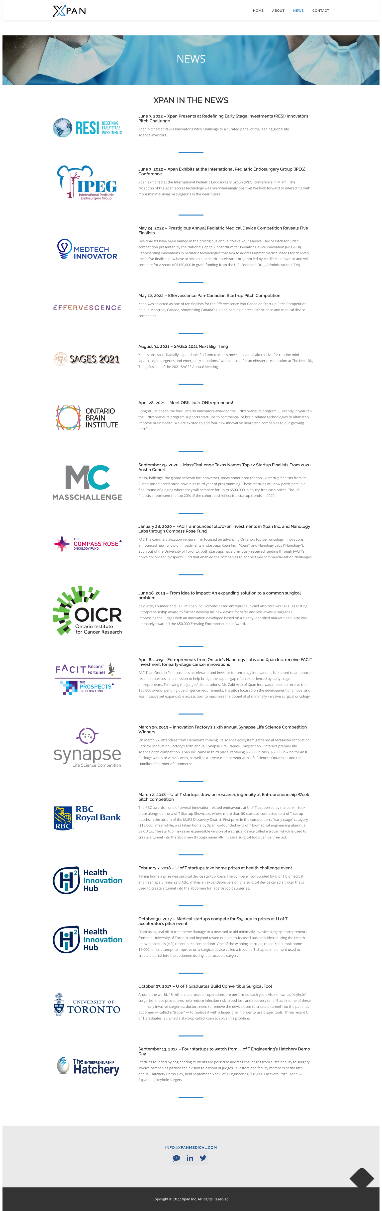
NEWS
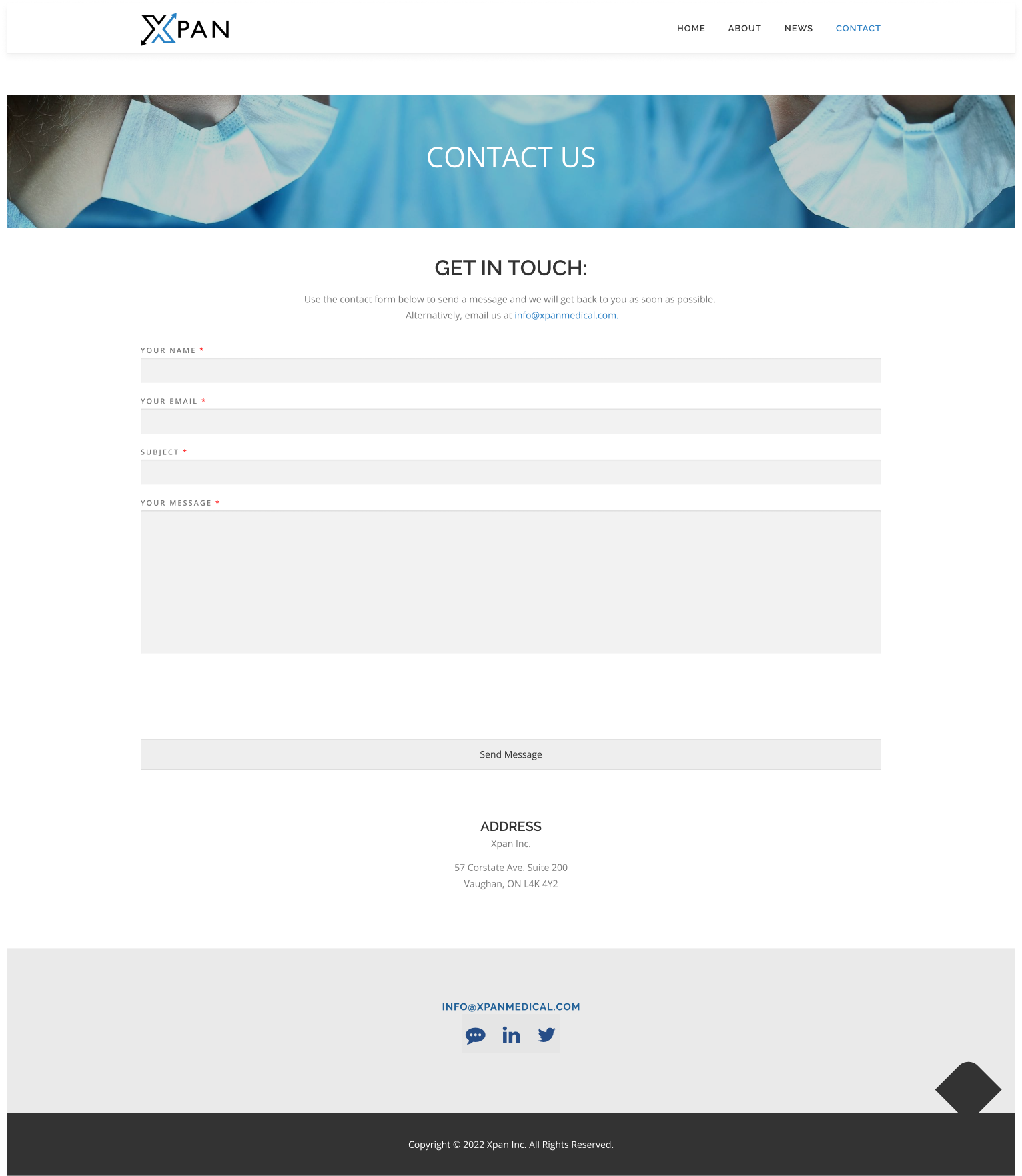
CONTACT
KEY TAKEAWAYS
Every website viewer/reader has a different opinion. It is difficult to make a website universally appealing to potential end users, investors, and partners all at the same time. Sometimes, content and design decisions will have to be made that will either maximize the appeal with more information, or target a specific audience with less. For all viewers, it is important that the what, how and who are clear. Google Analytics helped me understand which pages viewers were gravitating too, how much time was spent on each, etc. to better optimize the content for future.
VIEW MY OTHER PROJECTS:
Xpan: A Less Invasive Surgical Access PortPhysical Products
New Start Foundation: Logo & Web DesignDigital Products
Fino: A Youth Financial Education AppDigital Products
AR Needle Guidance System for Heart Fluid AspirationPhysical Products

100% Reusable Faceshields for COVID-19Physical Products