Fino: Designing a Financial Education App Concept for Young Canadians.
SUMMARY
My journey to understanding personal finance was challenging, overwhelming and non-linear; a sentiment most of my friends and colleagues share. During the BrainStation Product Management Certificate project, I wanted to pursue this problem space and develop a solution that would help young adults navigate personal finance, in the way that we all needed growing up.
I worked within a cross-disciplinary team of business students, designers and product managers to develop the product strategy, and continued beyond the certificate to work on the design and prototyping myself.
My Role: UX/UI Designer, Product Manager
Timeline: March 2022 - Present (WIP)
Tools Used: Figma, Notion, InVision

PROBLEM
80% of young Canadians are walking into the real world without a solid foundation in the basics of personal finance [1], leading to debt that they are unable to pay off, little to no savings and minimal knowledge of the importance of investing, due to a lack of direction and access to clear and helpful information.

SOLUTION
For: young adults who struggle to understand, plan and manage their personal finances and make informed financial decisions.
Solution: A mobile-based educational app backed by psychology & neuroscience that streamlines and gamifies the financial literacy process to create a more enjoyable and successful learning experience.
Think Duolingo for personal finance.
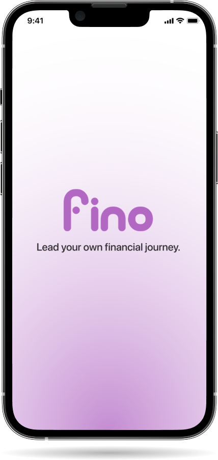
Fino mockup

DESIGN PROCESS
DISCOVERY: USER RESEARCH
Our group (ages 25-28) collectively faced challenges with financial literacy growing up, however we wanted to understand whether these challenges are still prevalent within current young adults aged 18-22.
Our hypothesis was that the majority of 18-22 year olds have a basic understanding of personal finance: they are aware of the concepts of budgeting, saving and investing but only few implement them.
We recruited 6 undergraduate students from our friends, family or professional colleauges to learn about their state of financial literacy.
Sample Questions:
- How would you rate your knowledge of personal finance (1-10)?
- Describe how you have learned about personal finance (e.g. through parents, online, etc.).
- Describe a time where you saved up for a big purchase (e.g. gift, travel).
- Do you use a credit card? If so, what do you know about credit score?
- Do you have TFSA or RRSP accounts? If so, can you describe how you use them?
- Have you invested in other ways (e.g. crypto)?
- What is your interest level in improving your financial literacy?
Main Findings:
- 5/6 interviewees had student loans but were not actively planning to pay them off
- Only 1 was confident in their knowledge of investing, and begun setting up a TFSA (for reference, you can be 18 to set one up)
- 3/6 had credit cards but did not use them often
- 5/6 have their parents manage taxes, and they do not have a good understanding themselves
- The most common sources for financial education online courses, Youtube, Reddit and some use budgeting apps (e.g. Mint, mainly focused on budgeting and saving versus a holistic understanding of taxes, saving, credit, investing and beyond)
PERSONAS
After we synthesized our interview insights, we developed personas that would be used to drive human-centered design decisions. For example:
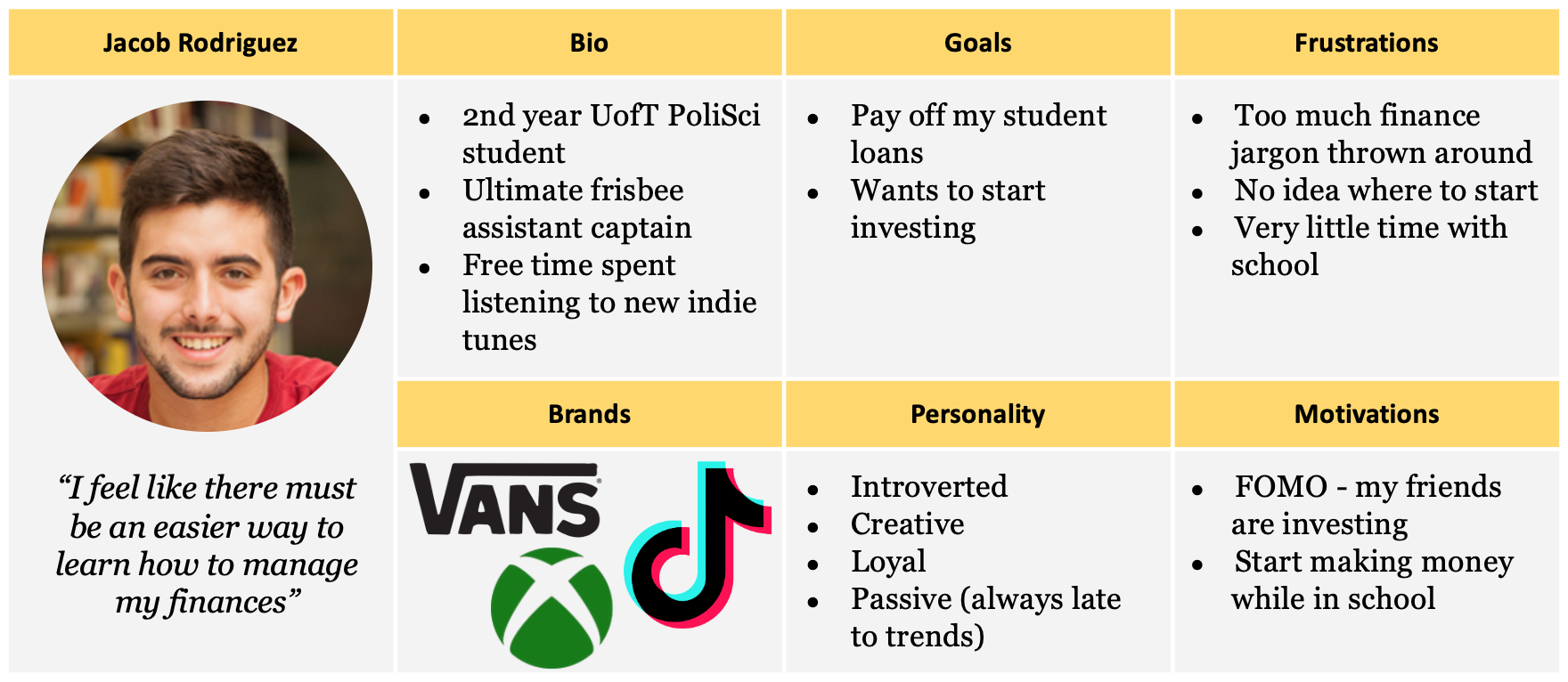
Persona example
USER STORIES
Leveraging Jacob's persona, we used Notion to develop an initial list of user stories under 7 different epics, organized by user value. Some of these user stories include:
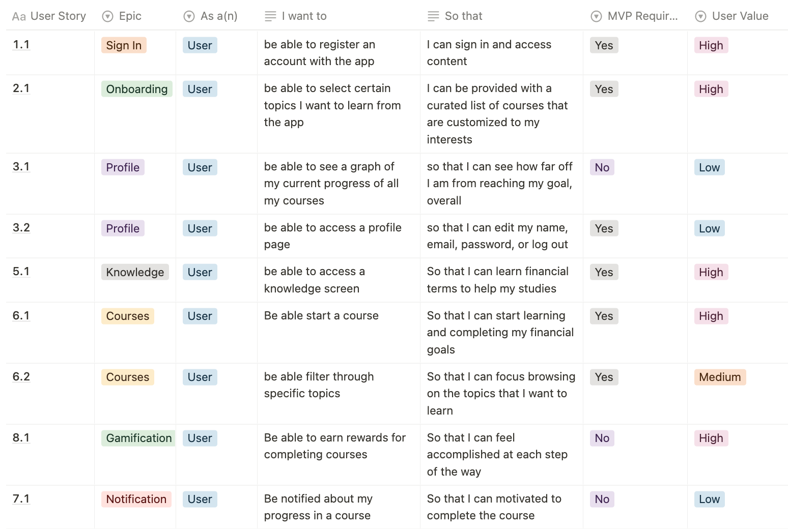
User story examples
USER FLOW
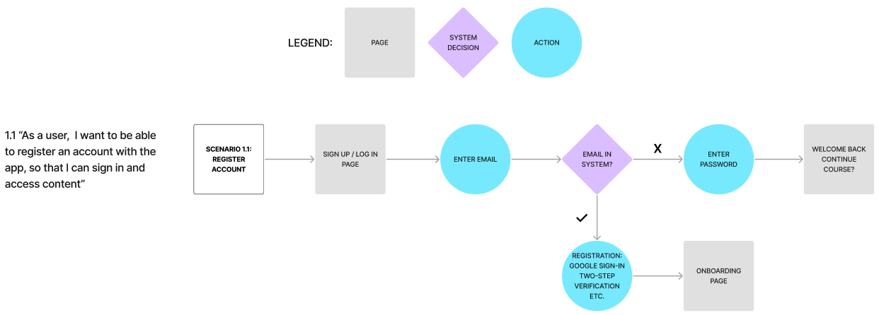
After developing a set of user stories and prioritizing, I started to develop flows in Figma for how a user might sign up, be onboarded to the app, and how they would start a course.
1. Sign-Up Flow
2. Onboarding Flow
3. Starting a Course Flow
WIREFRAMES
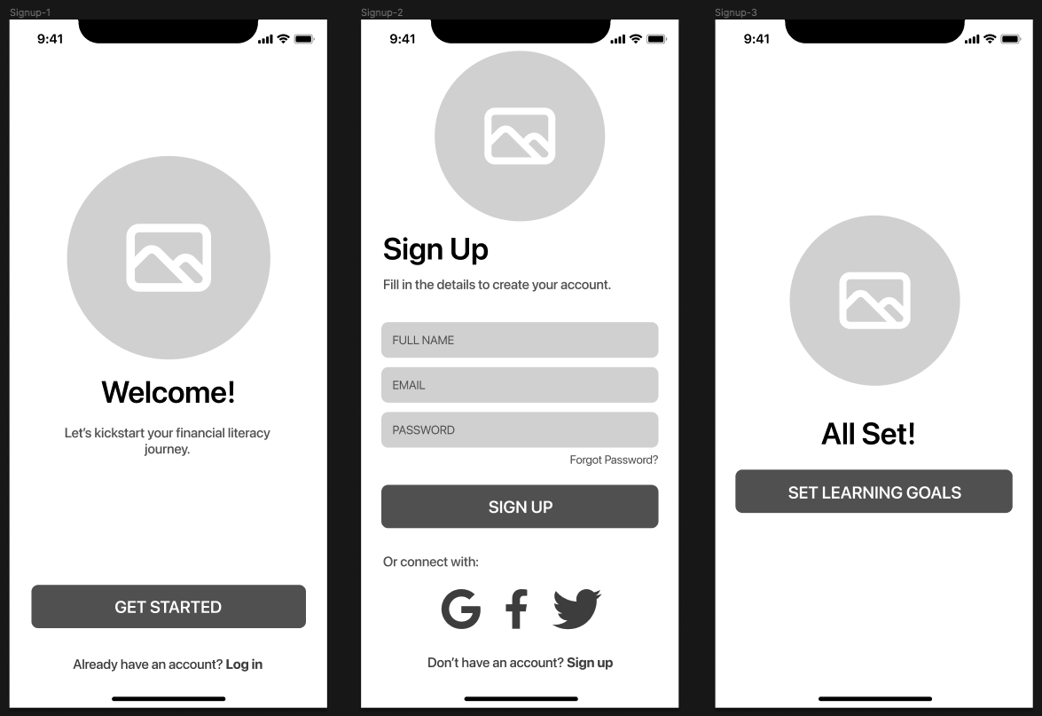
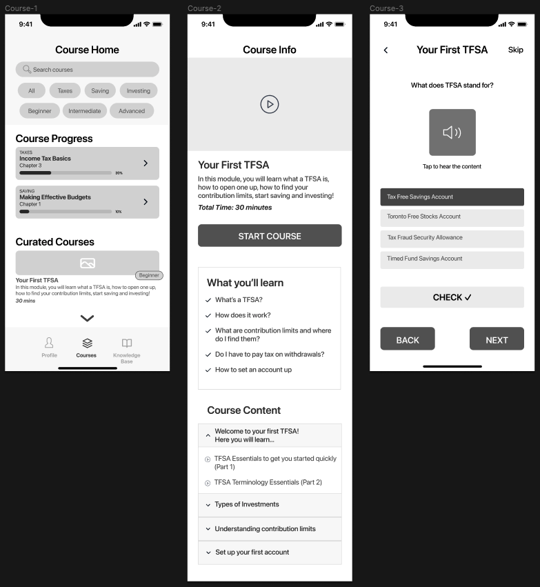
Based on these user flows, I developed some wireframes.
1. Sign-Up Wireframes
2. Onboarding Wireframes
3. Starting a Course Wireframes
BRAND IDENTITY
INSPIRATION
After developing the wireframes, I wanted to think about what the brand embodies. Six words that I felt aligned well include:
- Confidence
- Independence
- Learning
- Empowerment
- Enjoyable
- Future
- Opportunity
- Freedom
I then created moodboard with imagery and colour that I thought represented these words and the overall brand.

Mood board
COLOUR PALETTE
Extracting colours from this moodboard, I chose purple as the main brand colour. Purple is a transformative colour, representative of empowerment and in some cases, wealth. I wanted to emphasize that you are in control of your own financial journey. It is also different from most financial apps out there, which commonly use blue & green.
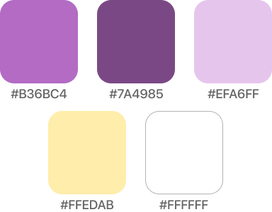
Colour palette
TYPOGRAPHY
This product was designed as a native iOS product, thus I chose Apple's SF Pro Display font, which has a modern, sans serif font. It also follows Apple's Typography Human Interface Guidelines.
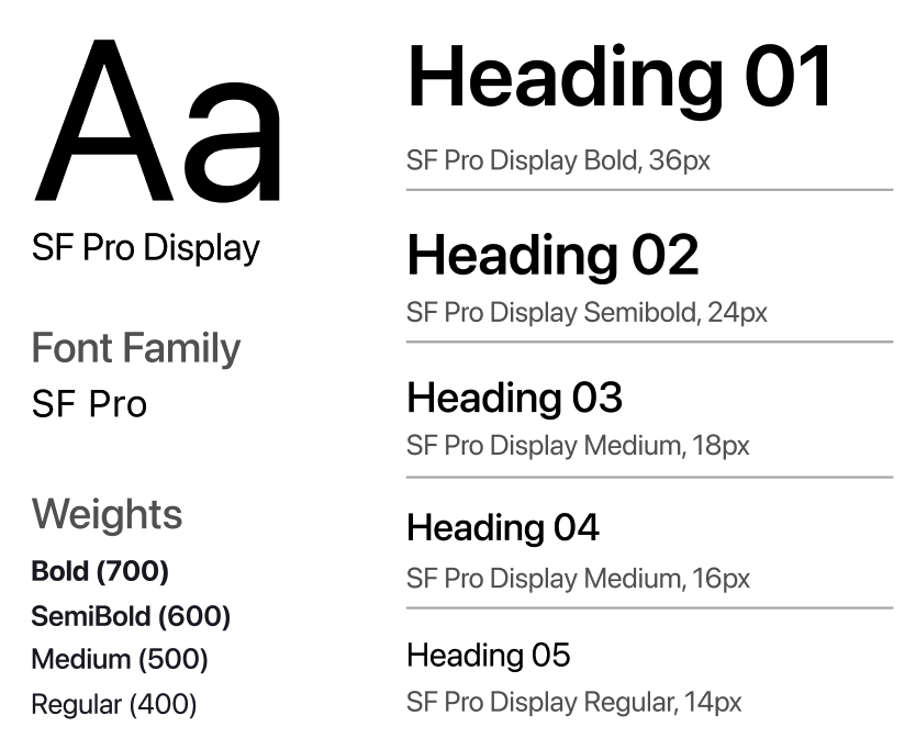
Typography
LOGO
When developing the logo, I wanted to stay consistent with the modern & futuristic theme, since this app will be the 'future' of financial education.

Logo
PROTOTYPE
MVP: WEBSITE LANDING PAGE
Before significant time and money is spent on developing the app, the first step would be to release an MVP. For this project, a website landing page seemed appropriate. Here, we could promote the financial learning platform, while simultaneously collecting quantitative and qualitative data. Quantitative data would include tracking # of signups, and qualitative would include tracking what users want to learn about/understanding the biggest needs. HotJar could be leveraged to track user flow on the website. Ideally, this would be paired with a blog or social media page to help drive traffic.
The MVP could look something like this:
MVP landing page
COLOUR INJECTION
This colour version is a work in progress as I get additional user feedback on the UX of the wireframes.
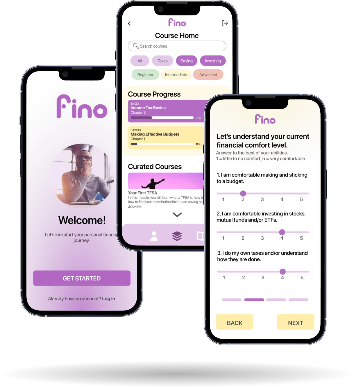
Colour mockups
FUTURE WORK
This project is still in the early stages, and there is still much work to do. Next steps would involve:
- Releasing MVP website, gauge interest quantitatively and qualitatively
- Run AB tests on wireframes and early prototypes, iterate based on response
- Continue research into the psychology behind learning, understanding how to 'gamify' and make content engaging
- Develop content
- Partner with financial institutions and/or investment platforms
Success metrics for a V1 launch could include:
- Activation Rate: 30%
- Creating account & 5 mins spent exploring app
- Retention Rate: 25%
- Active users completing 1 course every 90 days
- NPS: 3
- Average score from 1-10, recommending to a friend
VIEW MY OTHER PROJECTS:

Xpan: A Less Invasive Surgical Access PortPhysical Products

Xpan Brand Revitalization: Logo & Web DesignDigital Products
New Start Foundation: Logo & Web DesignDigital Products

AR Needle Guidance System for Heart Fluid AspirationPhysical Products

100% Reusable Faceshields for COVID-19Physical Products
